Chirp!:

    Showing posts with label tiles. Show all posts
    Showing posts with label tiles. Show all posts

    Wednesday, May 08, 2013

    Hello Deliciousness! x

    I wanted to  title this post "Holy Sh!tballs"!  .. but then, i'm not crass like that.

    Much.

    Sometimes.


    hallway


    Actually, I don't like swearing a whole lot, it makes me wince to hear it.
    But it lends impact at times, and I enjoy it as a humourous exclamation point.

    In other words: it's ok when I do it, but if you do it...


    ( i'm a really excellent mother, my fave game being do as I say, not as I do )


    bluestone splashback


    But seriously, I went to the house last night and they were still at it hammer & tong ( note: no tongs actually witnessed ) until 5.30pm!  Normally I pop in after school and they are just cleaning up, or sometimes already gone.  I got these just as the light was leaving, and cranked the ISO. 

    Smoke & mirrors.


    living


    I.freaking.LOVE.IT!


    tv unit


    Lights!  Pendants!  Splashback!  Cabinetry!

    Those blokes had it all goin' ohn, and it's starting to look *amazing*


    Eep!

    Sunday, April 21, 2013

    Paint/Tiles Paint/Tiles

    Because i'm a fussy beast, i've found and decided what I want, but keeping my options open
    with a couple of new tile places suggested to me that aren't over the other side of town.

    I loooove the bluestone, but i've found something even prettier I haven't seen in store yet. 
    Still natural stone, still blue, but with the added interest of autumn tones..

    Autumn, my favourite season

    Anyway.. we'll see, the race is on...

    Painting Decisions..

    ^^
    this is the kitchen/living/pantry to date ..
    not much visual change besides the fireplace is in place.
    The stonetops are in now too, but the template remains as a protective cover, and it's
    heavy and dusty, so i'll leave that reveal for another day..


    In other news, i'd decided paints and was quite smug and confident.. except the painters
    uh-oh
    .. undercoated some internal doors I think my husband was hoping to sand back
    and restore.  Because we were never sure/decided on this anyway, we've decided to let them
    get on with it, and if it sucks, we strip them back and start again later on down the track.

    But I don't have colours for doors.

    What I do know though is that I love hi-gloss enamel on doors and trims, so keep in mind
    the look will be glossy.

    And maybe a blue-grey.  Kinda like the bluestone I seem so fixated on ...


    Painting Decisions..


    The main paints are:
    WALLS: Dulux White Duck Half-Strength ( more a light beige )
    TRIMS: Dulux Vivid White ( as name suggests .. )

    DOORS: Well, as of yesterday ( armed with a dozen grey swatches .. my favourite being
    Mallard Grey - it's a Mallard!  It's a duck!  Get the connection! .. but it was too red/purple
    ) ..
    I ended up with something called Monk Grey ( it's the middle colour above the door-handle up there )

    Again, I have a thing for contrast.. but am wondering if I should just keep them in white?
    They look good in the pics white, but .. in real-life?  Not.so.sure.


    Painting Decisions..


    I have a similar blue-grey on the roller blinds, which you can see a bit of, and of course,
    there will be a bluestone splashback ( 99.8% sure ) and i'll be continuing those over at the
    fireplace fascia..

    BUT!  Will it be too dark?  And where do I stop - should I make ALL my doors dark grey,
    or just those in the original end?  It seems I really am bad at decision making ;)


    Painting Decisions..


    Painting Decisions..


    In fact, the more I look at these, I totes think dark grey is the way to go.
    Opinions, both good & bad, always welcome..

    xx
    Lea

    Friday, April 12, 2013

    Every NO brings you closer to a YES

    So i'm sorta getting there on the kitchen .. it's getting darker earlier now, so by the time
    the builders leave I am playing with stuff in minimal light and the kids are whining for food.

    Happy Space.


    splashbackblog1


    Pic 1.

    Love the uneven tiling, and the colour is perfect.  Unfortunately, the finish I want doesn't come
    in the colour I want, and the colour I want has a weird finish.  Working on it.


    splashbackblog3


    Pic 2.

    Whever I see silver travertine in store, I drool over it.  Can also get my random lines of
    thick/thin and differing lengths .. but when I get it home I think it's too wishy-washy and I
    really need the darker contrast of above. 

    Trying to source something similar in bluestone .. in a semi-polished finish. 
    Have a sample of a ceramic that works to LOOK like bluestone, but the fakeness annoys me....


    splashbackblog2


    This is a perfect colour.  It's Graphite from Southern Splashbacks, in their Matrix range.
    BUT, i've discovered I don't like the uber-reflectability of glass, and the tile patterns
    are all uniform.


    So .. where i'm at now:


    - looking for an afforable stepped stone with a uniform profile
    ( not that jutty-out stacked stone you see in landscaping .. the ones above are flat-fronted )
    and a polished front ( shiny, but not too shiny )

    - the brushed steel under-island kicker is gone .. apparently you can do painted kraftboard
    under the kicker, which means I can paint it whatever I like, and when I want to change it,
    I simply do that. 
    I freaking heart paint  ♥

    - the pendants.  Which I love, but, depending on the splashie, may be wrongtown in tone. 
    However, I figured I could make up a watery dye solution to darker/lighten/colour them
    if needed.. which appeals because that also means I could colour them yellow or teal or red
    if I freaking wanted, and it wouldn't matter, because hello .. paint! ..

    Paint has always been my saviour..

    The husbo would be horrified probably .. but hey, i'm not in love with many pendants
    out there atm, and if I got ( for eg ) non-offensive, safe neutral white glass .. then that's it
    for 10years or so, because changing kitchen pendants = at least $300 for new lights
    + a sparkie to change them.  That aint going to happen. 

    I do like the simple 'nude' glass pendants out there atm, but know a few people that wished
    they didn't due to kitchen steam/dust and they get incredibly grotty. 
    Plus, you can't paint glass, can you.  No. 
    So I think my concrete is more enduring.  For me. 

    Even if you're horrified I might paint them..


    asker-container__66151_PE178298_S4


    Finally, it's a big splasie - vast .. needs breaking up.  I've *always* installed a rail or two
    in every kitchen i've ever had, and this one will be no different.  I bought a couple of these
    cute pots from IKEA yesterday to hang off them, like you can see in the pics above. 
    I love fresh herbs and I love the pop of green.  I'll take them down when cooking,
    but I like the thought of natural stone with natural living herbs.

    Oh - and Tolix stools .. yeah .. dunno .. i'm unsure what all the hype is about?  
    I don't mind the one I used above, and i'm not anti-Tolix .. I just think they're a little bit
    overtrending atm?  A lot of people are suggesting them to me :)

    I quite like these though:


    stool


    I found them on Houzz. 
    Love.

    Tuesday, April 09, 2013

    Double-Denim?

    I mocked this up in Photoshop last night, using an i-phone pic of the stacked tiles,
    a jpg of the cement pendants, and a rather careless blob of grey in place of the stainless
    steel under-bench kicker.

    Probably could have tried a bit harder there.

    Also threw in the exact oven/stovetop ( it's a freestanding all-in-one job ) and a tap
    that looks like the tap I bought.


    Double Denim?


    The problem?

    Wellllll .. it's hard to tell here .. but is there enough lift?

    Friends on facebook suggested black pendants, but I am sooo in love with these. 
    I also think the stacked tile suits the great expanse of splashback there.

    ( 10 minutes later - blogging in real time, folks )


    kitchensofarwebwithstuff

    Ok, so added some "stuff" .. perhaps I can break up the splashback by adding a couple of shelves.
    Pretty impractical for herbs, but I like the green.

    But I do NOT like the brushed steel.  It's very .. disco ... hmm ...  I think  it would be darker
    than this??


    kitchensofarweb-stage-3


    Finally, above, I *LIKE* this .. BUT .. I think the splashback is DARKER, hence, do I need
    the pendants to be darker??  Secondly, these pendants do NOT come in a darker shade,
    which means a shop return and buying something else in black.  Which I don't want to do
    ( because these are soooo beautiful ).

    I like the darker kicker....


    You'd think i'd actually think about stuff BEFORE building a kitchen, huh?

    Suggestions, and stockist advice most appreciated!!


    xx
    Lea

    Sunday, April 07, 2013

    It's all about the Journey..

    The problem with liking so much STUFF and having so much style on offer and at
    your fingertips is that you could go one of many, many ways and still be completely happy. 

    Or I could.

    We could be Provincial .. we love that store .. wing chairs, whites and heshians,
    crates and rustic things.  Beautiful. 
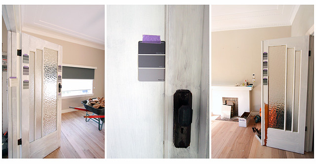
    If i'd retained a shaker profile in my cupboards and dressed them with black knobs or pulls,
    I probably wouldn't have had to return these beauties to Schots:

    0704blog4


    Nice, huh?  I told them if I bought another house and did another kitchen,
    I would come back and buy them in a flash. 
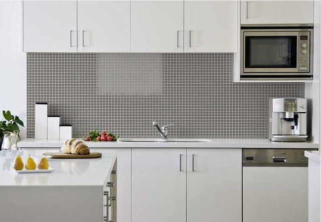
    I love black & white & beige.  Classic tones, sophisticated elegance..


    But I went handle-less and clean lines..  that's considered rather modern. 
    Am I modern? 
    Did I think that far ahead? 

    No, not really.. I kinda just .. do stuff .. and make things work. 
    I'm more adept at *fixing* things and making bad spaces good than I am at planning
    things from scratch I think. 

    More experience, I suppose ;)


    0704blog3


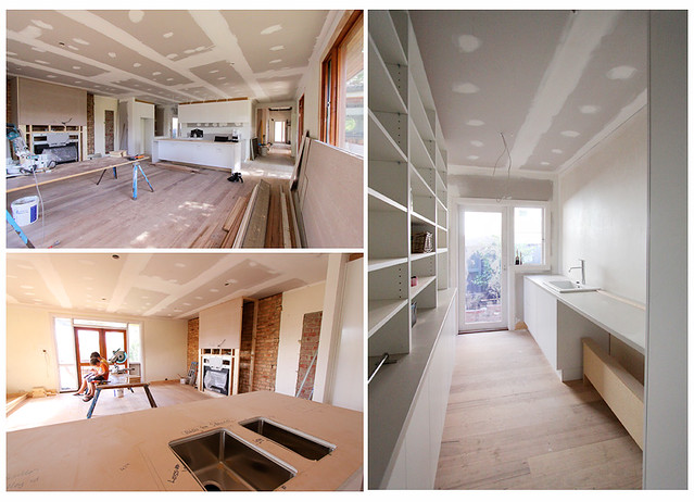
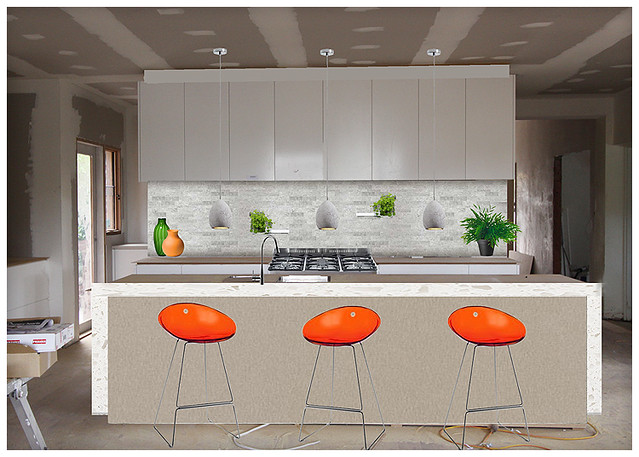
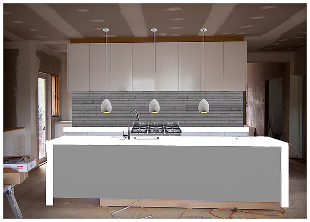
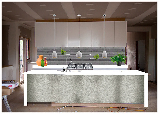
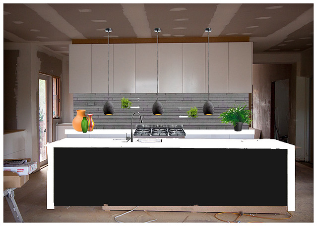
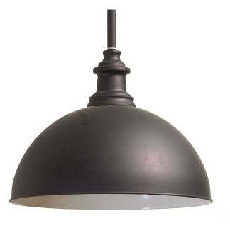
    So it happened with the carcass went in, I realised the large black domes were not going to work.
    Plus I selected a large black light for my bedroom and large black drums to go down the hall.

    Overload. 


    They also impeded my sightline when I entered the living area from the hall.  Too much.

    So they went back. 

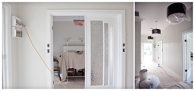
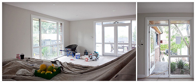
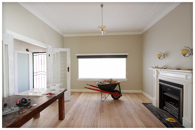
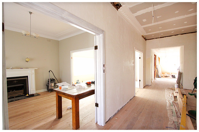
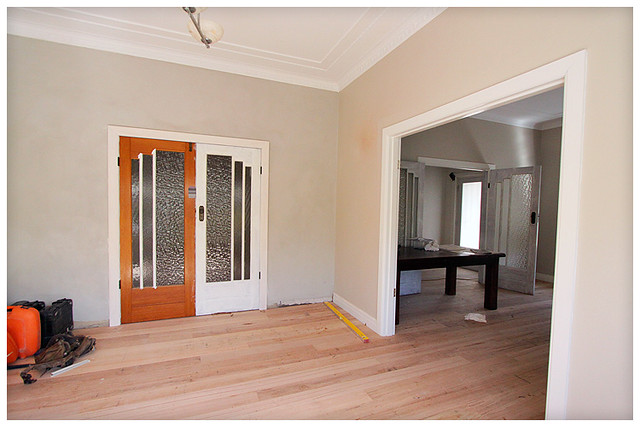
    Look at these pics I took on my iphone throughout the day:


    0704blog5


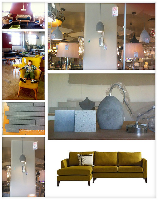
    Unintentional, but it seems I have a mustard/grey thing going on. 
    You can get all snobby and say that look was sooooo a few years ago, but then, i'm not here
    to impress you, am I?  No I am not.  Besides, my mustard chairs are still going strong. 

    The funny thing is, I wouldn't say I am really a fan of either mustard OR grey. 
    But some things simply beckon...


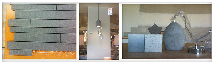
    So I went to Beacon on the way home and picked up the pendants 2nd on my list. 

    They are made of *concrete*.  I love concrete.  I love the colour and texture and variations. 
    As soon as I brought them home, I realised they were *perfect*. 
    My house is starting to dress itself..


    0704blog2


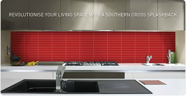
    My tiles have all been wrong too.  I've got a stainless steel kicker under the island bench,
    and I needed to tie them in.  Or change the kicker, which I could probably still do...
    ( pretty sure I can )

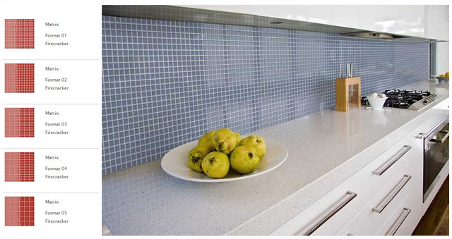
    But I think i'm getting closer.  I decided again I needed a more matt look, some texture,
    so the glass tiles, as beautiful as they were, are out.  I'm looking at stones now ..
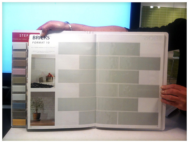
    and see that stepped stone thing my husband is holding up below?


    0704blog1


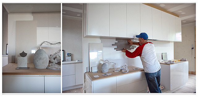
    Well, that was a bit awkward to carry, so the tile lady gave me a big tile to carry them on. 
    I laughed and said 'wouldn't it be funny if this helper tile was the right tile?' .. and you know what? ..
    it actually doesn't look bad in tone ( see above ).  It's semi-gloss, but it's BEIGE, pretty much
    the same colour as the walls will be ( White Duck Half ) .. so that's boring ..
    but it's also pretty and light.  I could add interest via tile shape maybe ...

    The other option is the tiles my husband is holding up, but in a more slate colour
    ( these are a coffee colour I grabbed because they  were lying around as a return and
    I mainly wanted to look at the shape of them


    I'm pretty sure this is what I will do.. ( have you heard that before? )


    There will be downlights in the cupboards above to pick up colour at night etc.
    What do you think?

    A nice dark dramatic contrast .. or a pretty lifting palette?

    Please don't think of things such as sealing or grout or oil splashes .. that's all ok..
    it's more the shape of the tiles and the colour i'm interested in.. what would you do?

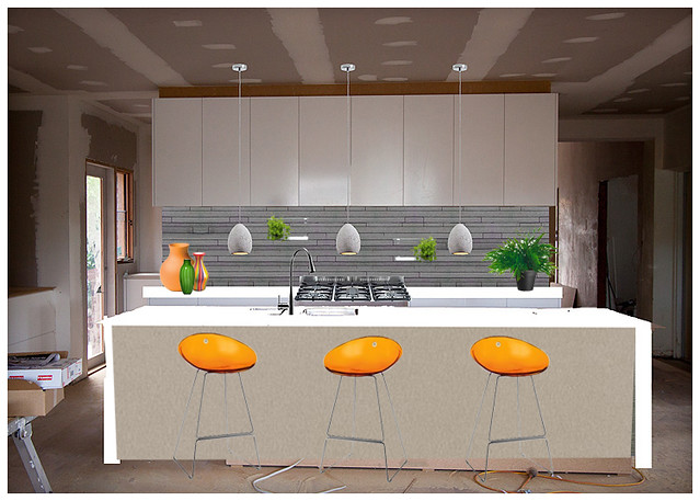
    Also, on a final note, this is the image I have submitted for my loungeroom cabinetry/
    fireplace/tele configuration.  
    Again with the yellow warmth of the lighting and the painted greys ...  hmmm


    0704blog6


    I also wouldn't mind that view :)


    xx
    Lea

    Wednesday, April 03, 2013

    Tile, Tile Baby...

    Splashback!  Holla!


    I have found the most divine tiles in all of the world.

    Even better, they are Australian Made & Owned .. right here in Melbourne!
    So beautiful, I dream of them.

    I'm down to a choice between two formats.. and a bazillion colours.

    From their site:

    Southern Cross Ceramics has been manufacturing designer ceramics since 1987
    and leads the world with its unique solid Murano glass on porcelain technology.


    Yeah, i'm impressed.


    I first saw their tiles in our local tile place.  Mesmerising.
    However, with limited samples etc, I called the manufacturer and they said I could pop on over.
    Expecting a dingy warehouse and a surly bloke who spoke in grunts,
    I was pleasantly surprised to be genuinely welcomed into their showroom..


    tile2


    They put on a video for the kids and I spent an HOUR there with the lovely Miranda
    while we mutually admired each other's good taste, and then she sent me home with a
    variety of samples, which I will now be returning and exchanging for others
    ( sounds like my kitchen pendants, huh ? ;)

    The thing is, I chose too safe.  Besides my body screaming out for the Kiwi..
    or the Barley Sugar.. or the Chilli or the Turquoise ... I took home some milder shades
    that would 'blend' and 'not date'.

    How boring.


    Do these tiles look like they want to play safe?
    No.  No they don't.

    tiles-format


    ^
    This is the lovely Miranda's arms as she holds up one of the formats I am debating. 
    Format 10 is fine for a safer colour I think.. but I think my heart yearns for ...


    tilecombo


    Matrix Format 2.  Yes, that's right, the one with lots of grout to suck up the spills and splashes.

    But you know what?  I'll deal with that for the pretty. 
    Miranda even gave me information on a 100% stain proof grout they recommend,
    so nice try, korma curry.. nice try spag bol, you aint got nothing on us!

    tile-porpoise2


    If you're in the market for tiles, I totally recommend a visit to Southern Cross Splashbacks.
    They have an online tile visualiser ( that I used for a couple of these pics here ), but not all
    the formats and tiles are available.  However, you can get a good indication of colour,
    and then go from there. 


    tiles1


    Please note I was neither paid nor received product for this recommendation...  I just get
    a bit excited sometimes and want to share the pretty.
     
    However, if they do happen to read this and want to offer me free tiles and/or discounts, hell yes i'd say, thanks muchly, that would be *grand*
    And I would tile the whole house.


    Yes.I.would.  Well.. maybe.  ( I'd definitely add a bit of colour to my bathroom )


    xx
    Lea