your fingertips is that you could go one of many, many ways and still be completely happy.
Or I could.
We could be Provincial .. we love that store .. wing chairs, whites and heshians,
crates and rustic things. Beautiful.
If i'd retained a shaker profile in my cupboards and dressed them with black knobs or pulls,
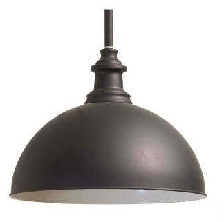
I probably wouldn't have had to return these beauties to Schots:

Nice, huh? I told them if I bought another house and did another kitchen,
I would come back and buy them in a flash.
I love black & white & beige. Classic tones, sophisticated elegance..
But I went handle-less and clean lines.. that's considered rather modern.
Am I modern?
Did I think that far ahead?
No, not really.. I kinda just .. do stuff .. and make things work.
I'm more adept at *fixing* things and making bad spaces good than I am at planning
things from scratch I think.
More experience, I suppose ;)

So it happened with the carcass went in, I realised the large black domes were not going to work.
Plus I selected a large black light for my bedroom and large black drums to go down the hall.
Overload.
They also impeded my sightline when I entered the living area from the hall. Too much.
So they went back.
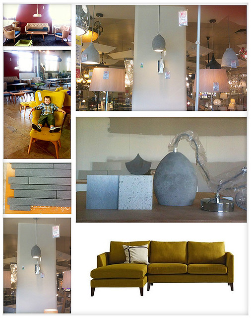
Look at these pics I took on my iphone throughout the day:

Unintentional, but it seems I have a mustard/grey thing going on.
You can get all snobby and say that look was sooooo a few years ago, but then, i'm not here
to impress you, am I? No I am not. Besides, my mustard chairs are still going strong.
The funny thing is, I wouldn't say I am really a fan of either mustard OR grey.
But some things simply beckon...
So I went to Beacon on the way home and picked up the pendants 2nd on my list.
They are made of *concrete*. I love concrete. I love the colour and texture and variations.
As soon as I brought them home, I realised they were *perfect*.
My house is starting to dress itself..

My tiles have all been wrong too. I've got a stainless steel kicker under the island bench,
and I needed to tie them in. Or change the kicker, which I could probably still do...
( pretty sure I can )
But I think i'm getting closer. I decided again I needed a more matt look, some texture,
so the glass tiles, as beautiful as they were, are out. I'm looking at stones now ..
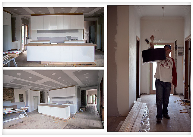
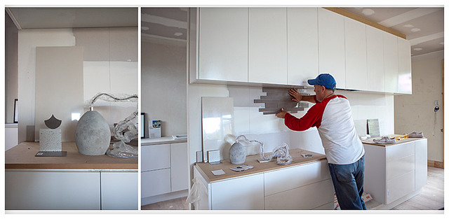
and see that stepped stone thing my husband is holding up below?

Well, that was a bit awkward to carry, so the tile lady gave me a big tile to carry them on.
I laughed and said 'wouldn't it be funny if this helper tile was the right tile?' .. and you know what? ..
it actually doesn't look bad in tone ( see above ). It's semi-gloss, but it's BEIGE, pretty much
the same colour as the walls will be ( White Duck Half ) .. so that's boring ..
but it's also pretty and light. I could add interest via tile shape maybe ...
The other option is the tiles my husband is holding up, but in a more slate colour
( these are a coffee colour I grabbed because they were lying around as a return and
I mainly wanted to look at the shape of them )
I'm pretty sure this is what I will do.. ( have you heard that before? )
There will be downlights in the cupboards above to pick up colour at night etc.
What do you think?
A nice dark dramatic contrast .. or a pretty lifting palette?
Please don't think of things such as sealing or grout or oil splashes .. that's all ok..
it's more the shape of the tiles and the colour i'm interested in.. what would you do?
Also, on a final note, this is the image I have submitted for my loungeroom cabinetry/
fireplace/tele configuration.
Again with the yellow warmth of the lighting and the painted greys ... hmmm

I also wouldn't mind that view :)
xx
Lea


2 comments:
Hmm .. ok, so I woke up this morning and relaised the tiles AND the pendants is a bit too much like double demin.
Have now got more tiles in my possession to try, try again .. x
This is cool!
Post a Comment
Hey, You just read me, and this is crazy,
But here's my Blogger, Comment maybe <3