Today i'm armed with the Caesarstone book.
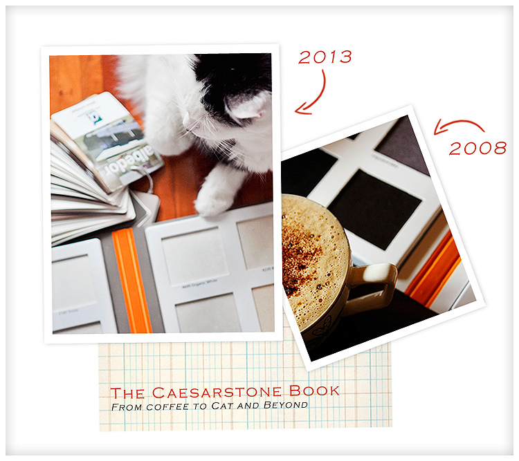
I'm amused that it's the same book I was given in 2008 when we did our bathroom renovation ( below ).
Wook at my baybee!
Isn't he gorgeous?
He turns 5 tomorrow ♥
Anyway, enough of the motherly schmo .. back to the reno..
( See what I did there? )
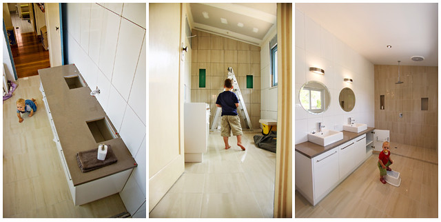
In 2008 I chose Ginger.
This year, we're going more subtle .. which is hard because I naturally gravitate to high contrasty things. I can *admire* your white-on-white-on-white decor at YOUR house ( or your white-on-white-on-white with a smidge of pale cream ), and I often do .. but for myself ...
Look, i've lived for years in imperfect homes and have learned to make do and improvise. One of the BEST things i've enjoyed about imperfect homes is that you can't ruin them, and you can play with them. It's like an old favourite shirt versus that $2k designer gown you bought. Whereas a splash of paint on your shirt is fine and kinda blends in with the grass stains and the cake mix .. that designer gown is tres tres precious, so there's no jumping on that sofa, kids.
In old homes, you can paint your bathroom blue one day, or paint your back door emerald green. It's a temporary lift, and colour is fun. I loved my emerald green door, and the blue bathroom sure rocked the khaki that preceded it.
I must find a pics somewhere ( pre-digi days, on filum peoples, filum! ).
Last night I found a hot raspberry laminex chip and told the kids we should use it in the kitchen.
But alas, I have to be a bit more grown-up when i'm spending oodles of money.
I have to be more classic, more enduring, more .. beige.
And that's ok too, becuase I quite like a beige/white/black palette ( which is what i'm doing ).
It allows me to pick up colour in accessories and not be shut into something i'll regret in two years time. I can still be whack in my greenhouse and play with my colour pots out there, and bring in new stuff as I fancy.
After all these years, I still love a red sofa, and my jeweltones are back in vogue too.
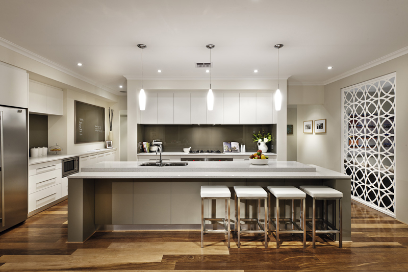
So these are the colours i'm thinking for our kitchen island. It's a "waterfall" island which means the pretty extends and falls down the sides, like the pic below from Caesarstone in NIMBUS.

NIMBUS is one of the colours I am considering, but I haven't seen any in slab form yet.. just in little tile chips. I'm going to take a look tomorrow. Am unsure about the big chips vis teeny tiny little chips thing over a big area .. it's something you can't glean from a chip.
Colours i'm considering:
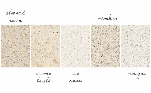
As you can see, there's a decision to be made re: warm vs cool as well. I'm hoping some nice chunky slabs will sort that one out. ATM i'm thinking either Nimbus or Nougat .. we'll see .. we'll see..
What next?
Plumbing is in and the sparkies were there yesterday.
We need to buy an extraction fan for the stove STAT to the cabinetmaker can build his framing to fit perfectly.
Tomorrow I will be buying the rangehood and checking our lighting. Schweet!
xx
Lea